INTRO
First project. Like first love, it'll always have a special place. This brought me long back to my university days when I'd always go the "hard way" as some would say while I liked to call it "the real way" and choose a project that would be built on real ground, actual needs and limitations as opposed to creating on a clean slate.
So I did here when prompted to design a mobile payment app for a restaurant I chose to ground my design in reality and picked Dishoom, a small Bombay-inspired restaurant group with locations throughout the UK.
HOW CAN DISHOOM MAKE THEIR CUSTOMER EXPERIENCE EVEN BETTER?
- why install another app when I can do it the "old way?"
CHALLENGE
WHY HAVE APP?
Dishoom has mastered turning a possible inconvenience into an integral part of their customer experience. Since dinners and brunches are so popular across branches, it's quite likely you'd need to queue to get in. While this can be a setback for some, Dishoom treats their waiting customers and has a system of waiting at the bar and so the waiting time doesn't feel so long. No solution is sustainable, customer base keeps growing but venues are not inflatable. Is the a potential for faster table turnover?
inconvinience
efficiency
<
- let's change customers perspective from above to this:
habit
another app to download
>
How? Let's try and eliminate or improve as many pain points possible in the flow of checking out
COMPARE USER JOURNEYS

STRONG BRAND IDENTITY
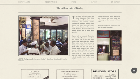
While each branch has its own story, Dishoom as a brand has a very strong and consistent visual identity. This speaks across site through their unique typography that dictates looks of all supporting products.
Dishoom's product encompasses the entire dining experience. The Dishoom payment app enhances this experience for customers and facilitates efficient operations for the business. It is a crucial complementary product that aligns with the branding hierarchy, therefore its user interface (UI) is crafted to match the existing signature style used in print.
That being said, both the user experience (UX) design and UI have been developed to adhere to all the principles required for modern digital products, ensuring a seamless user flow and accessibility.
APP AS A COMPLIMENTARY PRODUCT
COLOURS
Fonts were selected to match and compliment Dishoom's existing typography with regards to digital usability.

BUTTONS & ICONS

TYPOGRAPHY

CONTEXT
A POPULAR RESTAURANT CHAIN ON DEMAND
Running a hospitality business in a bustling metropolitan area presents numerous challenges. Even well-established restaurants face intense competition and must continually innovate to retain their customers.
GROWING POPULARITY
While Dishoom has mastered the art of turning long queues into engaging experiences, seamlessly integrating what would otherwise be an unpleasant wait into the Dishoom experience, customers now desire a smooth and effortless exit once they've completed their dining.

This cannot always be guaranteed.
WHERE THE EXPERIENCE ENDS?
Given Dishoom's strategic locations in bustling and vibrant areas of metropolitan London, their customers are likely to be both time-conscious and technologically literate.

Is there an opportunity to enhance the overall experience?
WIN-WIN OPORTUNITY
With breakfast available seven days a week, live music, and high foot traffic, the combination of these factors places pressure on the staff to maintain service excellence while efficiently managing capacity turnover.

What if customers who have finished their meal could check out themselves?
Primary research was conducted through interviews with a representative sample of potential users. The interviews were centered around assessing the demand for such an app, understanding people's behavior and emotions while dining out, and exploring tipping and splitting habits along with preferences.
RESEARCH

RESEARCH TAKEAWAYS
-
Research participants seem to be generally open to the idea of using an app in order to expedite their check out as wait time has been identified as the main pain point.
-
They however don't seem to find this to be crucial to whether they eat out or not in most cases.
-
Tipping and splitting seem to make people uncomfortable in certain situations.
-
Payment security could be of concern to some users.
-
Loyalty rewards and further engagement sounds appealing to majority
DESIGN
GOAL STATEMENT
Dishoom mobile payment app will allow busy restaurant guests to check out quickly and easily without having to wait for the staff. Not having to call a waiter, request the bill, wait for them to bring the terminal or change will save a significant amount of time for those visiting the restaurant during the lunch period when most professionals are tight on their schedule. The ease with which they are able to leave the restaurant should be a contributing factor to their return. Rewards programmes and features like e-receipt history are set to encourage business lunch or dinner visits.
To ensure a smooth customer experience, the Dishoom app prioritizes features that directly impact their on-site dining experience.
Additionally, it offers extra features that improve the overall experience beyond the restaurant, such as planning future visits, shopping for products, and bringing the Dishoom experience to their home.
Furthermore, registered users can access and save VAT receipts and learn about each of unique Dishoom locations.

BROWSE
MANAGE
SAVE
MENU
PAY
REWARD
LOCATE
SHOP
DELIVER
SPECIFIC VALUE PROPOSITION
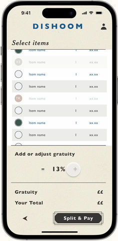
Dishoom app is a mobile payment app for a modern restaurant chain. It allows its users to check in to the table they have just ordered or finished their meal at, and pay instantly. This eliminates the frustration and time needed to hunt for the waiting staff, which can be difficult, especially during busy lunchtime. Additionally features like opt-in and opt-out from tipping with a tipping calculator and option to split make this experience awkward-free. The app is tailored specifically for a restaurant or a chain of restaurants, so a frequent customer can benefit from reward collection and receipt history. Research participants have often mentioned the need to be speedy, uneasy feelings about splitting bills and determining how much to tip and this app addresses all of these concerns. As a bonus returning customers will get a chance to internally rate the items in their order history so that they can come back to it when visiting again.
PAYMENT FLOW
SPLITTING OPTIONS
Multiple user studies have been conducted to understand user's behaviour in different likely scenarios.
* Where likelihood was determined based on previous research
*Read description in expand mode


TAKEAWAYS
Add paragraph text. Click “Edit Text” to update the font, size and more. To change and reuse text themes, go to Site Styles.
The research has revealed how complex a seemingly simple task, practiced for decades, becomes when translated into a digital product. Taking into account various scenarios and user preferences, I've crafted an app - a digital solution aimed at enhancing the offline experience with a focus on genuine connections.
The challenge was to create a flow that's brief yet effective, encouraging Dishooms customers to adopt it. This, in turn, contributes to quicker check-outs, faster table turnover, and a more eco-friendly world by reducing the reliance on paper receipts.


